There are not really any bad home jerseys, so I think it’s only fair to look further afield and consider the collection of jerseys. With that in mind, city connect jerseys have not been considered.
It is worth noting a few points which helped determine the top 10. Firstly, colour combination is the single most important ingredient in having good jerseys, that can include a unique colour combination. Secondly, a good logo, or logos, makes it a lot easier to produce an above average jersey (check out my MLB logo ranking). I also noticed the jersey combinations which rank high tend to have a great “classic” look for their home jerseys. They also have a bulk bold colour as an away or alternative.
Now if your team is not here, I am not criticizing your team, yet. That might happen in the next ranking of the 10 worst MLB jerseys.
10. Detroit Tigers
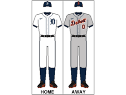
Detroit scrapped into the top 10 against some stiff competition. Their classic “D” on the home shirt is a huge tick and I love the addition of orange in the away to break from a mundane blue and white.
9. LA Angeles
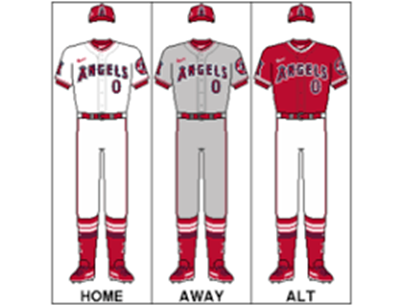
I may be alone having the Angels so high, but it’s a nice clean look and I dig the alternate, albeit the name does not stand out with red on red. Nearly every team also has a jersey with the city name embroidered across it, but the team from Anaheim, or is it LA?, only shows that they are the Angels.
8. Milwaukee Brewers
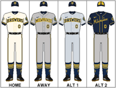
The Milwaukee rebrand was brewed perfectly. Blue and yellow is my favourite colour combination and these jerseys look so good. A baby blue or yellow alternative would elevate this further, but these are excellent.
8. St Louis Cardinals
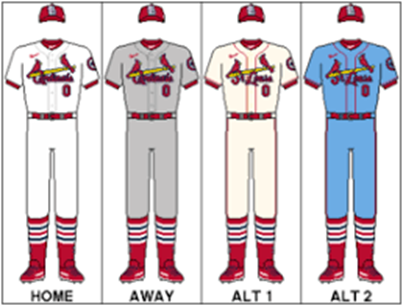
St Louis has great jerseys, many considering the home as one of the best. This combo is similar to the Angels, but with a powder blue alternative instead of the bulk red, plus more intricacy’s within the design. Just so you know, the powder blue is amazing and a few other teams have implemented this look to.
7. San Fransico Giants
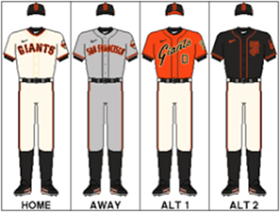
Giants stand out, and so does the colour orange. I love the orange and black look, coupled with a good logo and alternative logo, San Fransisco designers have an easy job making the players look awesome.
6. Kansas City Royals
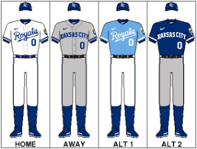
I might over use the word classic, but this is classic. Kansas City has got a great concept going, and with the baby blue alternate, they look like royalty.
5. Toronto Blue Jays
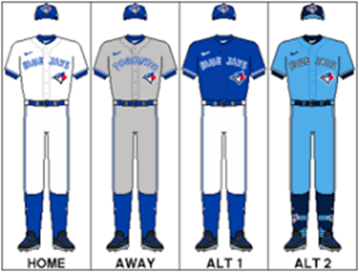
Toronto’s jerseys look great on the field and with the unique lettering the Blue Jays get a big tick. I love each shade of blue and they are consistent with the blue jay logo located in the same location on each jersey. These are neat.
3. Oakland Athletics
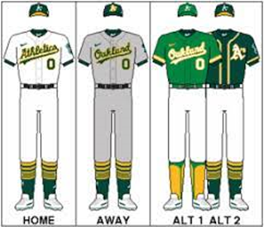
Oakland Athletics have a unique appearance with green and yellow colours, and they look fantastic. Not the best alternative jerseys to watch from the bleachers, but a superb set of jerseys nonetheless.
2. Chicago Cubs
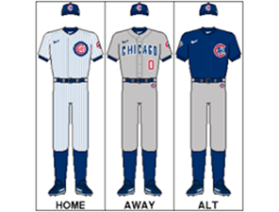
Chicago Cubs look absolutely fantastic. Literally top 3 best home jersey and top 3 best alternative jersey. My only change I would like to see is a cursive Chicago font on the away jersey, but maybe tradition is more important. The friendly confines are even friendlier when everyone is dressed immaculately.
1. Baltimore Orioles
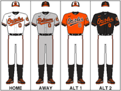
This may surprise some, and if orange isn’t your colour, forgive me. But just like the Cubs, each of these jerseys are great, but there are 4 of them! 4 outstanding jerseys which makes them an easy number one jersey combination for me. If you are one of the people who don’t like orange, try to put that aside and think about what else you would change… I’ll wait. If you can’t beat the Red Sox, Yankees and Blue Jays on the field, beat them in the fashion stakes and beat them on the Campaign & Reign ranking lists.
